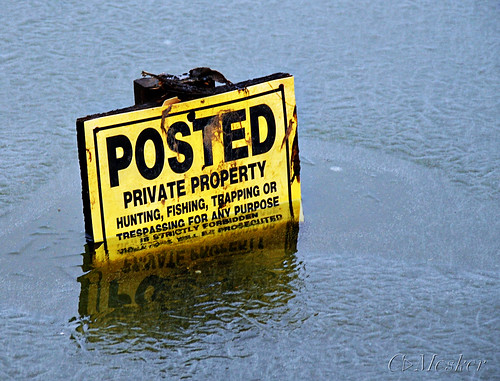
I don’t think much fishing will be done in this pond anytime soon!
If you’re not reading this via RSS I’m sure you’ve noticed a change in color scheme. I changed the template from a light color scheme to a black scheme to better display my photos. After trying many, many different themes I kept coming back to this one because I like the layout, the versatility and the ability to have my rotating images in the top banner. So I hacked around a bit and made it look how I wanted it to. I’d appreciate any feedback, any issues or problems you may find, etc. There are a few small things I will be tweaking, but probably nothing too drastic. I’ve also added the polls back on the right side if you enjoy poll type stuff. Happy Monday!


